How to Create Modern CSS Box Shadows: Depth, Realism & Trends
Master the art of UI depth. Learn how to use professional layering techniques to create shadows that look premium — without the CSS headache.
The Secret to Premium UI: It's all in the Shadows
In modern web design, shadows aren't just about making things "stand out." They are about establishing a visual hierarchy, creating a sense of depth (the "Z-axis"), and making interfaces feel tactile and intuitive.
Most beginners make the mistake of using a single, dark, blurry shadow. This often looks "cheap" and dated. Professional designers use **complex layering** — stacking multiple subtle shadows together to mimic how light actually behaves in the real world.
Understanding the 5 Values of `box-shadow`
To master shadows, you must understand exactly what the CSS property is doing:
- X-Offset: Moves the shadow horizontally. Positive values go right, negative go left.
- Y-Offset: Moves the shadow vertically. Positive values go down (simulating a light source from above).
- Blur Radius: Higher values make the shadow softer and more transparent at the edges.
- Spread Radius: Increases or decreases the size of the shadow source itself.
- Color (RGBA): Usually a dark color with low opacity (between 0.05 and 0.20) for a natural look.
Modern Shadow Trends to Watch
1. Soft Realism
This is the "standard" of premium platforms like Apple or Stripe. It uses high blur values (20px to 60px) and very low opacity. It makes cards feel like they are floating gently above the page.
2. Neumorphism
Neumorphism uses two shadows: a light shadow on the top-left and a dark shadow on the bottom-right. This makes the element look like it is extruded from the background itself. It works best on monochromatic designs.
3. Glassmorphism
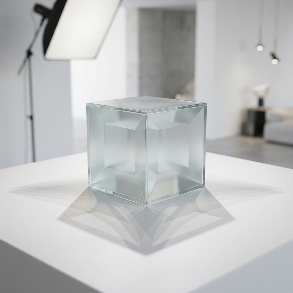
While Glassmorphism relies on background blurs, a subtle, sharp white outline (a "1px spread" shadow) combined with a deep, soft outer shadow is what truly makes the "glass" look real.
How to Use our Generator Like a Pro
- Start with a Preset: Use our gallery of 20+ professional presets (like "Floating", "Pressed", or "Neon") as a base.
- Fine-Tune the Layers: Our tool allows you to see the real-time CSS code as you adjust the sliders.
- Match your Brand: Don't use black for shadows on a blue site. Use a very dark navy blue for a much cleaner, more integrated aesthetic.
- Copy and Paste: Once perfect, click the "Copy CSS" button and drop it directly into your
.cardor.buttonclass.
Frequently asked questions
Do shadows affect website performance?
Simple layout shadows are very efficient. However, using 10+ layers of shadows on hundreds of elements simultaneously can cause "painting" lag on older mobile devices. Use them strategically on key components.
What is an `inset` shadow?
Adding the `inset` keyword causes the shadow to fall inside the element, making it look "pressed" into the page. This is great for input fields or clicked button states.
Should I use HEX or RGBA for shadow colors?
Always use RGBA (or HSLA). This allows you to control the transparency (alpha channel), which is essential for making shadows look natural and blending with the background.
Level up your design skills
Start creating interfaces that wow your users. Professional tools, at your fingertips.